CMU Researchers Introduce the Open Whisper-Style Speech Model: Advancing Open-Source Solutions for Efficient and Transparent Speech Recognition Training
SOURCE: HTTPS://WWW.MARKTECHPOST.COM/
OCT 03, 2023
Understanding the AUC-ROC curve in machine learning classification
SOURCE: ANALYTICSINDIAMAG.COM
SEP 05, 2021

Acritical step after implementing a machine learning algorithm is to find out how effective our model is based on metrics and datasets. Different performance metrics available are used to evaluate the Machine Learning Algorithms. As an example, to distinguish between different objects, we can use classification performance metrics such as Log-Loss, Average Accuracy, AUC, etc. If the machine learning model is trying to predict, then an RMSE or root mean squared error can be used to calculate the efficiency of the model.
In this article, we will be discussing the performance metrics used in classification and also explore the significant use of two, in particular, the AUC and ROC. Below is the outline of important points that we will be discussing in the article.
The metrics that one chooses to evaluate a machine learning model play an important role. The choice of metric influences how the performance of machine learning algorithms can be measured and compared. But, Metrics possess a slight difference from loss functions. Loss functions are meant to show the measure of model performance. They’re used to train a machine learning model, maybe using a kind of optimization like Gradient Descent, and are usually differentiable in the model’s parameters. Metrics on the other hand are used to monitor and evaluate the performance of a model during training and testing, not needing to be differentiable. The importance of various characteristics in the result will also be influenced completely by the metric.
One of the basic classification metrics is the Confusion Matrix. It is a tabular visualization of the truth labels versus the model’s predictions. Each row of the confusion matrix represents instances in a predicted class and each column represents instances in an actual class. Confusion Matrix is not entirely a performance metric but provides a basis on which other metrics can evaluate the results. There are 4 classes of a Confusion Matrix. The True Positive signifies how many positive class samples the created model has predicted correctly. True Negative signifies how many negative class samples the created model predicted correctly. False Positive signifies how many negative class samples the created model predicted incorrectly and vice versa goes for False Negative.
Precision-recall and F1 scores are the metrics for which the values are obtained from a confusion matrix as they are based on true and false classifications. The recall is also termed as the true positive rate or sensitivity, and precision is termed as the positive predictive value in classification.
Accuracy in terms of Performance Metrics is the measure of correct prediction of the classifier compared to its overall data points. It is the ratio of the units of correct predictions and the total number of predictions made by the classifiers. These additional performance evaluations help out to derive more meaning from your model.
AUC ROC is used to visualize the performance of a classification model based on its rate or correct and incorrect classifications. Further in this article, we will discuss in detail the AUC-ROC.
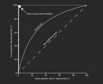
ROC curve, also known as Receiver Operating Characteristics Curve, is a metric used to measure the performance of a classifier model. The ROC curve depicts the rate of true positives with respect to the rate of false positives, therefore highlighting the sensitivity of the classifier model. The ROC is also known as a relative operating characteristic curve, as it is a comparison of two operating characteristics, the True Positive Rate and the False Positive Rate, as the criterion changes. An ideal classifier will have a ROC where the graph would hit a true positive rate of 100% with zero false positives. We generally measure how many correct positive classifications are being gained with an increment in the rate of false positives.
ROC curve can be used to select a threshold for a classifier, which maximizes the true positives and in turn minimizes the false positives. ROC Curves help determine the exact trade-off between the true positive rate and false-positive rate for a model using different measures of probability thresholds. ROC curves are more appropriate to be used when the observations present are balanced between each class. This method was first used in signal detection but is now also being used in many other areas such as medicine, radiology, natural hazards other than machine learning. A discrete classifier returns only the predicted class and gives a single point on the ROC space. But for probabilistic classifiers, which give a probability or score that reflects the degree to which an instance belongs to one class rather than another, we can create a curve by changing the threshold for the score.
Area Under Curve or AUC is one of the most widely used metrics for model evaluation. It is generally used for binary classification problems. AUC measures the entire two-dimensional area present underneath the entire ROC curve. AUC of a classifier is equal to the probability that the classifier will rank a randomly chosen positive example higher than that of a randomly chosen negative example. The Area Under the Curve provides the ability for a classifier to distinguish between classes and is used as a summary of the ROC curve. The higher the AUC, it is assumed that the better the performance of the model at distinguishing between the positive and negative classes.
The area under the curve is one of the good ways to estimate the accuracy of the model. An excellent model poses an AUC near to the 1 which tells that it has a good measure of separability. A poor model will have an AUC near 0 which describes that it has the worst measure of separability. In fact, it means it is reciprocating the result and predicting 0s as 1s and 1s as 0s. When an AUC is 0.5, it means the model has no class separation capacity present whatsoever.
AUC-ROC is the valued metric used for evaluating the performance in classification models. The AUC-ROC metric clearly helps determine and tell us about the capability of a model in distinguishing the classes. The judging criteria being – Higher the AUC, better the model. AUC-ROC curves are frequently used to depict in a graphical way the connection and trade-off between sensitivity and specificity for every possible cut-off for a test being performed or a combination of tests being performed. The area under the ROC curve gives an idea about the benefit of using the test for the underlying question. AUC – ROC curves are also a performance measurement for the classification problems at various threshold settings.
The AUC-ROC curve of a test can also be used as a criterion to measure the test’s discriminative ability, telling us how good the test is in a given clinical situation. The closer an AUC-ROC curve is to the upper left corner, the more efficient the test being performed will be. To combine the False Positive Rate and the True Positive Rate into a single metric, we can first compute the two former metrics with many different thresholds for the logistic regression, then plot them on a single graph. The resulting curve metric we consider is the area under this curve, which we call AUC-ROC.

AUC-ROC can be easily performed in Python using Numpy. The metric can be implemented on different Machine Learning Models to explore the potential difference between the scores. Here I have inculcated the same on two models, namely logistic Regression and Gaussian Naive Bias.
from sklearn.naive_bayes import GaussianNBmodel_naive = GaussianNB()model_naive.fit(X_train, y_train)
Just as discussed above, you can apply a similar formula using Python,
from sklearn.metrics import roc_curve, aucfalse_positive_rate, true_positive_rate, thresholds = roc_curve(y_test, y_prob)roc_auc = auc(false_positive_rate, true_positive_rate)roc_auc
Output :
SEE ALSO

Top 10 Tools To Kickstart Your MLOps Journey In 2021
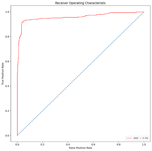
0.9592201486876043
A Deterministic AUC-ROC plot can also be created to gain a deeper understanding. Here, plotting for Logistic Regression ;

For Gaussian Naive Bayes,

The results may vary given the stochastic nature of the algorithms the evaluation procedure used or differences in numerical precision.
The AUC-ROC is an essential technique to determine and evaluate the performance of a created classification model. Performing this test only increases the value and correctness of a model and in turn, helps improve its accuracy. Using this method helps us summarize the actual trade-off between the true positive rate and the predictive value for a predictive model using different probability thresholds which is an important aspect of classification problems.
In this article, we understood what a Performance Metric actually is and explored a classification metric, known as the AUC-ROC curve. We determined why it should be used and how it can be performed using python through a simple example. I would like to encourage the reader to explore the topic further as it is an important aspect while creating a classification model.
Happy Learning!
LATEST NEWS
WHAT'S TRENDING


Data Science
5 Imaginative Data Science Projects That Can Make Your Portfolio Stand Out
OCT 05, 2022

SOURCE: HTTPS://WWW.MARKTECHPOST.COM/
OCT 03, 2023
SOURCE: HTTPS://NEWS.MIT.EDU/
AUG 17, 2023
SOURCE: HTTPS://WWW.SCIENCEDAILY.COM/
AUG 21, 2023
SOURCE: HTTPS://WWW.SCIENCEDAILY.COM/
AUG 17, 2023
SOURCE: HTTPS://WWW.SCIENCEDAILY.COM/
AUG 07, 2023
SOURCE: HTTPS://WWW.INDIATODAY.IN/TECHNOLOGY/NEWS/STORY/69-MILLION-GLOBAL-JOBS-TO-BE-CREATED-IN-NEXT-FIVE-YEARS-AI-AND-MACHINE-LEARNING-ROLES-TO-GROW-IN-INDIA-2367326-2023-05-02
JUN 28, 2023