


AI language models could help diagnose schizophrenia
SOURCE: HTTPS://WWW.SCIENCEDAILY.COM/
OCT 09, 2023
Expressing Emotion Through Typography With AI
SOURCE: UNITE.AI
FEB 24, 2022

Current trends and innovations in text communications (including email, messaging, and captioning systems) must negotiate the affective chasm between written and spoken speech in crude and approximative ways.
For instance, the last few years have brought alternating caps into vogue as a provocative meme in social media flame wars, while, the much-hated use of caps lock (as well as bold and jarring typographic effects allowed by some comment platforms) continues to provoke intervention from moderators. These are monotone and only broadly representative methods for clarifying the intent of the written word.
At the same time, the growth of popularity of emoticons and emojis, as a hybrid textual/visual sentiment conveyer, has actively engaged the Natural Language Processing (NLP) research sector in recent years, along with interest in the meaning of animated GIFs that users post in comment threads.
Over time, written language has evolved an innovative fund of these ‘additive’ linguistic methods, which attempt either to proxy emotion or to evoke it in the absence of the tonal information in the spoken word.
Usually, however, we need to render the emotion as best we can from the context of the written word. Consider, for example, the exclamation ‘Oh, Oh, Oh!’, at the conclusion of Lady Macbeth’s deranged nocturnal soliloquy, arguably a case study of the extent to which intonation can affect meaning.
In most adaptations, this pained lamentation lasts 2-6 seconds; in Trevor Nunn’s 1976 Royal Shakespeare Company production of Macbeth, Judi Dench took the reading of this line to a perhaps-unchallenged record of 24.45 seconds, in a landmark interpretation of the role.
A recent paper from Brazil proposes a system of speech-modulated typography that could potentially incorporate such prosody, and other paralinguistic components, directly into captioned speech, adding a dimension of emotion that’s poorly captured by the prepending of adjectives such as [Shouting], or the other ‘flat’ tricks available to closed caption subtitling conventions.
‘We propose a novel model of Speech-Modulated Typography, where acoustic features from speech are used to modulate the visual appearance of text. This could allow for a given utterance’s transcription to not only represent words being said, but how they were said.
‘With this, we hope to uncover typographic parameters that can be generally recognized as visual proxies for the prosodic features of amplitude, pitch, and duration.’

The workflow that transliterates prosody into typographic styling. Aiming to produce the most versatile and widely-deployable system possible, the authors limited themselves to baseline shift, kerning, and boldness, the latter being provided by the versatility of an open type font. Source: https://arxiv.org/pdf/2202.10631.pdf
The paper is titled Hidden bawls, whispers, and yelps: can text be made to sound more than just its words?, and comes from Calua de Lacerda Pataca and Paula Dornhofer Paro Costa, two researchers at the Universidade Estadual de Campinas in Brazil.
Though the broader aim of the project is to develop systems that can convey prosody and other parametric language features in captioning, the authors also believe that a system of this nature could eventually develop a wider audience in the hearing world.
There are many prior initiatives in this space, including a 1983 project that proposed a captioning system that might include ‘special effects, color, and capital letters [to represent] the rich tonal information denied deaf children[.]’.
By contrast, the Brazilian project is able to take advantage both of automated transcription and new developments in affect recognition, which combine to enable a workflow that can import and characterize the components in a speech soundtrack.
After the prosodic features are extracted and processed, they are mapped to the time-stamps of the words in the speech, producing tokens which can then be used to apply rule-based modulation of the caption typography (see image above).
This result can visually represent the extent to which a particular syllable might be protracted, whispered, emphasized, or otherwise hold contextual information that would be lost in a raw transcription.

From the test phase of the project, note the way that kerning (the space between letters in a word) has been widened to reflect a protracted pronunciation.
The authors make clear that their work is not intended to contribute directly to emotion recognition and affect recognition research, but instead seeks to classify the features of speech and represent them with a simple and limited range of novel visual conventions.
At the very least, the additional emphasis the system provides disambiguates sentences where the object of action may not be clear to viewers who cannot hear the sound (either through disability or the circumstances of playback, such as noisy environments).
To borrow my own example from 2017, which took a look at the way machine learning systems can also have difficulty in understanding where the object and the action lie in a sentence, it’s easy to see the extent to which emphasis can radically change the meaning of even a simple sentence:
I didn’t steal that. (Someone else stole it)
I didn’t steal that, (I negate the allegation that I stole it)
I didn’t steal that. (I own it, theft does not apply)
I didn’t steal that. (But I did steal something else)
Potentially, a mechanistic prosody>typography workflow such as the Brazilian authors suggest could also be useful as an adjunct in the development of datasets for affect computing research, since it facilitates the processing of purely text-based data that nonetheless incorporates some pre-inferred paralinguistic dimensions.
Additionally, the researchers note, the extra linguistic payload of prosody-aware text could be useful in a range of NLP-based tasks, including customer satisfaction evaluation, and for the inference of depression from text content.
The framework developed by the researchers offers variation in baseline shift, where a letter may be higher or lower relative to the ‘baseline’ on which the sentence rests; kerning, where the space between the letters of a word may be contracted or extended; and font-weight (boldness).
These three stylings map to the extracted features of speech to which the project has constrained itself: respectively, pitch, duration, and magnitude.

The progression of styling on a sentence. In #1, we see the syllable boundaries that have been defined in the extraction process. In #2, we see a representation of each of the three modulations (magnitude|weight, kerning|duration, and pitch|baseline shift), applied singly. In #3, we see the combined typographic modulations in the final output, as presented to the 117 participants in a trial of the system.
Since a single typeface may require an additional and separate font for variations such as bold and italic, the researchers used a Google implementation of the OpenType font Inter, which integrates a granular range of weights into a single font.

From the paper, a chart detailing the extent to which an OpenType glyph from the Inter font can express a range of bold emphases along the skeleton of the minimal base spline.
The expression of kerning and baseline shift was incorporated into a browser plugin, which enabled tests conducted on 117 hearing-enabled participants.
The dataset for the tests was created specifically for the project, by hiring an actor who read a selection of poems several times with a different emphasis on each take, corresponding to the three features that the project is studying. Poetry was chosen because it allows a range of emphases (even beyond the poet’s intent) without sounding artificial in nature.
Participants were split into two groups. The first were given 15 rounds of the actor’s reading of a stanza accompanied by synchronized, animated and modulated text, which unfurled in time with the audio clip.
The second group received exactly the same set of tasks, but were presented with static images of the modulated text, which did not change at all during the playback of the actor’s readings.
The average rate of correct answers was a non-random 67% for the static image group, and 63% for the animated text group. Participant comments solicited by the researchers after the trials confirmed their theory that the cognitive load of dynamic interpretation may have contributed to the lower scores for the non-static tests. However, the kind of captioning and message systems that such a framework would be intended for typically provides per-completed text by default.
Participant comments also indicated that there are hard limits to the use of kerning to indicate duration, with one commenter noting that when letters are spaced too far apart, it becomes difficult to individuate a word.
The researchers also note:
‘[Some] participants felt the model should be able to embody more nuanced and complex representations of speech, which it should do with a more varied and expressive visual vocabulary. While this is not a simple task, it is nevertheless encouraging to imagine how different applications of speech-modulated typography could branch out as this new field develops.’
First published 24th February 2022.
LATEST NEWS
Augmented Reality
Hi-tech smart glasses connecting rural and remote aged care residents to clinicians
NOV 20, 2023
WHAT'S TRENDING


Data Science
5 Imaginative Data Science Projects That Can Make Your Portfolio Stand Out
OCT 05, 2022

SOURCE: HTTPS://WWW.SCIENCEDAILY.COM/
OCT 09, 2023
SOURCE: HTTPS://WWW.THEROBOTREPORT.COM/
SEP 30, 2023
SOURCE: HTTPS://WWW.SCIENCEDAILY.COM/
AUG 08, 2023


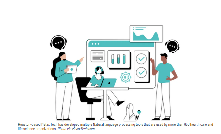
SOURCE: HOUSTON.INNOVATIONMAP.COM
OCT 03, 2022

SOURCE: MEDCITYNEWS.COM
OCT 06, 2022